THE HOME OF GOLF
Evolving one of the most iconic sporting brands in the world has to be done delicately. For St Andrews, the challenge was to find a balance between prestige, heritage, and modernity, steering away from antiquated tradition to become a brand that represents everyone who plays the game of golf.
St Andrews Links is globally recognised as The Home of Golf. More than just a destination, St Andrews is the source of the sport – a place where the game began, but also where the spirit of the game still flows from today.
This idea is represented in the evolved identity for St Andrews Links. Every element of the new visual identity is rooted in the heritage and physical landscape of St Andrews Links. The fluidity of the design represents that spirit flowing out into the world.
The new logo draws inspiration from, and pays homage to, the Swilcan Burn that weaves through the Old Course and out into the sea.
The ‘cuts’ in the logo represent the three stone bridges golfers use every day to cross the burn, including the world-renowned Swilcan Bridge.
Each of the seven courses has a new icon, inspired by a unique aspect of each course’s history or identity. The illustrative style conveys the flowing nature of the burn and how ‘the source’ runs through every aspect of St Andrews Links.
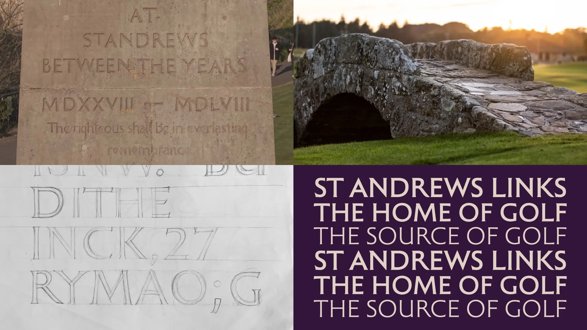
The new bespoke St Andrews Links font is inspired by the most famous typography on the site: the Martyrs’ Monument, which overlooks the Old Course.
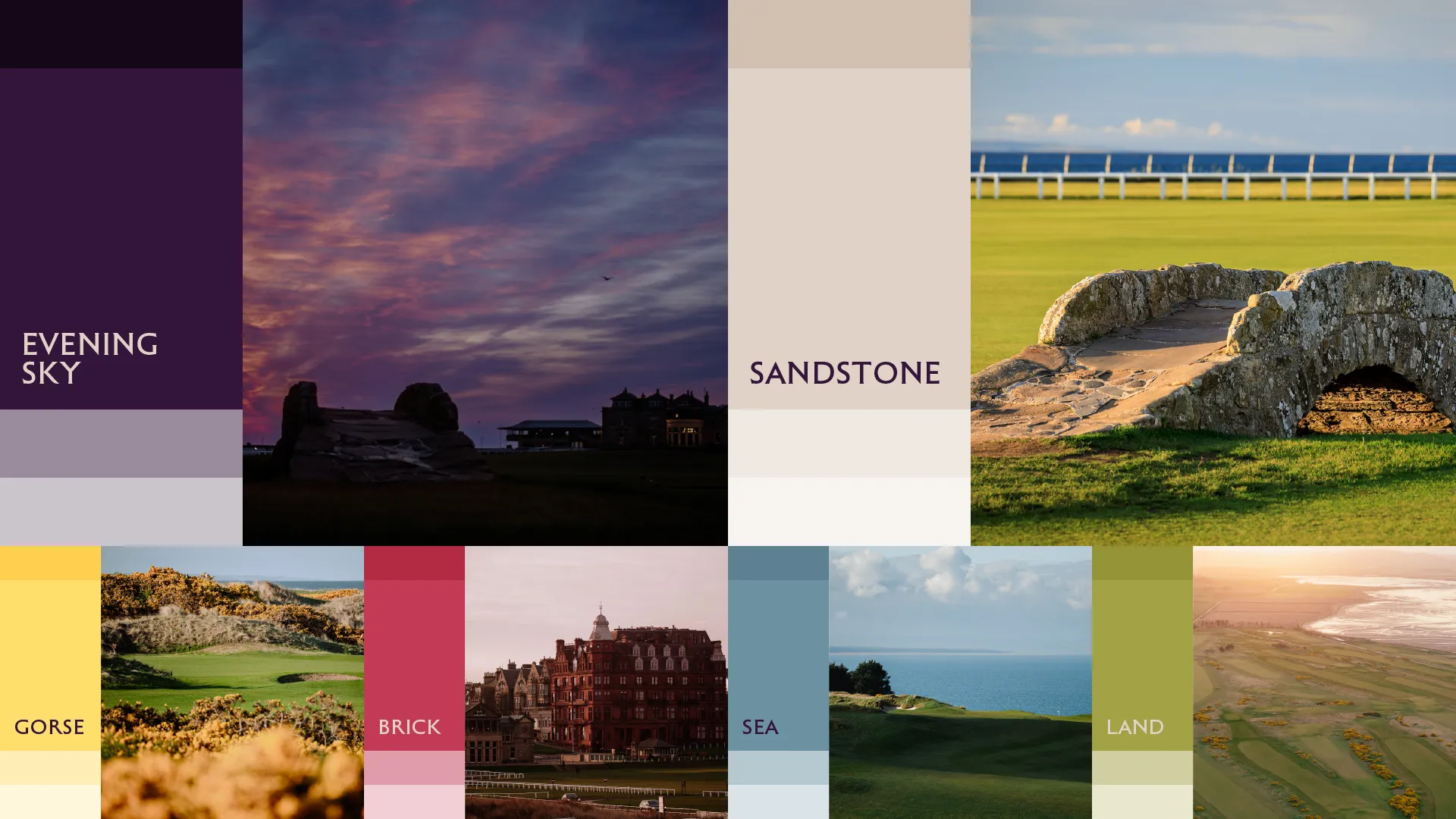
The new colour palette celebrates the natural beauty of the St Andrews landscape and landmarks.


